


SIP & SAVOR

Throughout my time at Whole Foods Market—producing visual elements for advertisements and promotional campaigns—I’ve aspired to take on a more creative leadership role, conceptualizing and directing larger-scale projects. While my current role in the Studio Production team primarily keeps me behind the scenes, I’ve had the privilege of gaining insight into the creative team’s process for executing our monthly elevated events. One of my favorite things about food is its incredible ability to bring people together. Sip & Savor exemplifies this, offering a chance for loved ones to gather and indulge in a curated selection of products.
The event encourages customers to discover and enjoy life’s little luxuries, whether it’s a small indulgence or a moment of self-care. By featuring an array of products such as wine, cheese, fresh fruits, nuts, jams, spreads, dips, chocolates, candles, beauty and body care items, Sip & Savor creates a space where our customers can celebrate and elevate the everyday. This is exactly the type of project that inspires me—a chance to merge creativity with connection, enhancing how people experience both food and community.
Overview
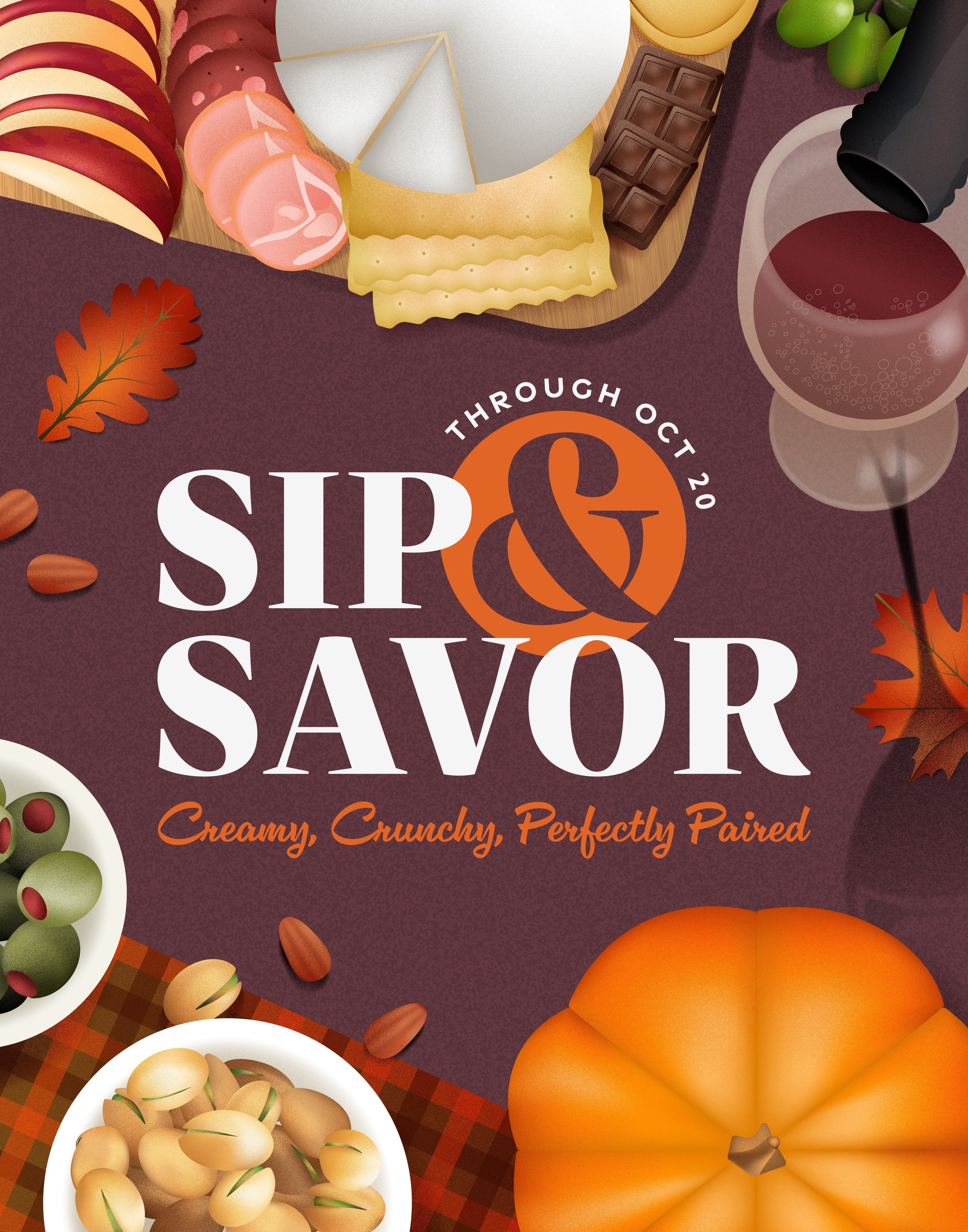
During the discovery phase of this project, one of the earliest and most exciting challenges was naming the concept. I’ve always been drawn to the charm and memorability of alliteration, so I knew from the start that I wanted the name to reflect that. Sip & Savor encapsulated the essence of the experience I was striving to create. It wasn’t just about sampling delicious foods and beverages; it was about transforming simple gatherings into memorable experiences. However, settling on a tagline proved to be another creative challenge. I wanted something that would complement the name while elevating the overall concept. Initially, I had settled on the tagline Elevate Every Gathering.
Discovery


I initially set out to capture the essence of Sip & Savor as a celebration of flavor, connection, and elevated indulgence. However, the first iteration lacked a clear seasonal identity. The color palette, illustrations, and typography didn’t anchor the event to a specific time of year or highlight the featured products in a compelling way.
To refine the concept, I revisited the core of Sip & Savor. Charcuterie boards and wine pairings are especially popular in the fall and winter, when people are hosting gatherings and looking for festive snacks. I determined that fall would be the ideal backdrop for the event, shaping the overall visual and thematic direction


With this in mind, I researched fall-centric grocery items commonly associated with charcuterie: pinot noir, brie, aged gouda, salami, prosciutto, apples, grapes, olives, pistachios, almonds, and pumpkin-infused pairings. To reinforce the autumnal theme, I introduced a richer, more seasonal color palette and visual elements like fall leaves, warm wood textures, and gingham napkins, evoking a cozy, inviting feel.
It was very important to me that texture was incorporated into the illustration, because it adds warmth and subtle depth to the compositions. The perspective is top-down, resembling a bird’s-eye view of a table setting, giving viewers a direct sense of participation in the dining experience.
For the type lockup, I took cues from wine and cheese packaging, opting for classic serif fonts and elegant cursives. This creates a refined, sophisticated look that immediately connects with the products being featured.
For the tagline, I wanted to highlight textures and flavor cues, leading to a revision from "Elevate Every Gathering" to "Creamy, Crunchy, Perfectly Paired."


This evolution of Sip & Savor not only strengthens its seasonal presence but also heightens its appetite appeal.
Sip & Savor Concept


After developing the concept and graphic elements, the next step in creating an elevated event experience is the photography process. It begins with crafting a planned shot list that is designed to encapsulate the essence of the event as well as key products. For this particular event, my goal was to encapsulate a warm and inviting ambiance while maintaining an upscale feel. The imagery should evoke the essence of a memorable evening spent with good food and great company, creating a visual narrative that feels both relatable and aspirational.
Photography Art Direction


The reference photos share a cohesive aesthetic built around warm, neutral tones and a mix of textures. The use of whites, browns, and metallic tones provides a muted backdrop that complements and enhances the vibrant colors of the food, making them stand out without overwhelming the composition. The smooth surfaces of the plates contrast with the natural grain of the wooden dish-ware and the hammered texture of the knife handles, adding depth and visual interest.
Prop Guidelines:
White Ceramic Bowls and Plates per
WFM standardsWhite linen background
Grey napkins
Wooden charcuterie board
Wooden fruit bowl
Cheese knives with rustic handles
Wine glasses
Prop Inspiration


The Hero shot features an overhead shot of a beautifully arranged charcuterie board and its accompaniments, all presented on a white textured tablecloth. The board is central to the image and packed with a variety of items. The main focus of the hero plate is the blue cheese wedge, cubes of cheddar and Colby Jack, and a slice of creamy Brie and Gouda. Another major focus are the slices of cured meats like salami and prosciutto arranged in neat folds and ribbons, encircling the cheese and small white bowls of almonds, pistachios and jam. There are thin, rectangular crackers are fanned out along one side of the board, and stacked in the corner on the opposite side. Fresh strawberries, blueberries, and green grapes are placed decoratively, filling in the crevices between larger items. Dried fruits like apricots and cranberries also add color and texture in these smaller areas. Nestled among these items are dark chocolate squares. Placed around the board are bowls of mini pickles and green olives. A creamy hummus spread with a drizzle of olive oil and chili flakes sits in a small dish. There are two plates present, to suggest a gathering of friends and family enjoying this spread. One small plate features a piece of bread topped with cheese and fruit. The second plate has crackers topped with meats, cheese, and dried fruit. Additionally, there are two glasses of white wine placed around the setup, which enhances the atmosphere. Adding warmth and ambiance to the composition, decorative additions such as the wooden bowl adorning fruit, a yellow candle in a glass jar, and grey linens are present.
Hero Shot

Styling reference: Charcuterie board should look bountiful.

Mood: Elegant, with balanced colors and textures. Inviting feel perfect for entertaining or sharing.

Surface reference: white textured tablecloth.

Light reference: Dramatic directional lighting.


With my concept finalized, it was time to bring it to life through the photo shoot. I carefully curated the charcuterie board and styled the scene on my kitchen table. To achieve a balanced, directional lighting effect, I utilized a mix of natural afternoon light streaming through the windows and an artificial tripod light. Using a Sony camera mounted on an overhead tripod, I captured the shots from a top-down perspective. After the shoot, I refined the images with minor edits in Adobe Lightroom and Photoshop to ensure a polished final result.

Final Shot
Concepting, designing, and photographing the "Sip & Savor" event was a rewarding creative journey that allowed me to hone my skills as a designer. From developing a cohesive visual identity to selecting props and styling compositions, each step was an opportunity to balance appetite appeal with the practicality of showcasing the products. Crafting imagery that evoked warmth, community, and the joy of sharing elevated snacks and wine with friends challenged me to think deeply about lighting, composition, and storytelling. I learned how to effectively use visual elements to highlight key features and create a sense of accessibility and elegance. This project also reinforced the importance of attention to detail and adaptability, as I navigated between concept ideation and execution to bring the event to life visually. Ultimately, this experience deepened my understanding of how design can connect with customers and inspire memorable experiences.