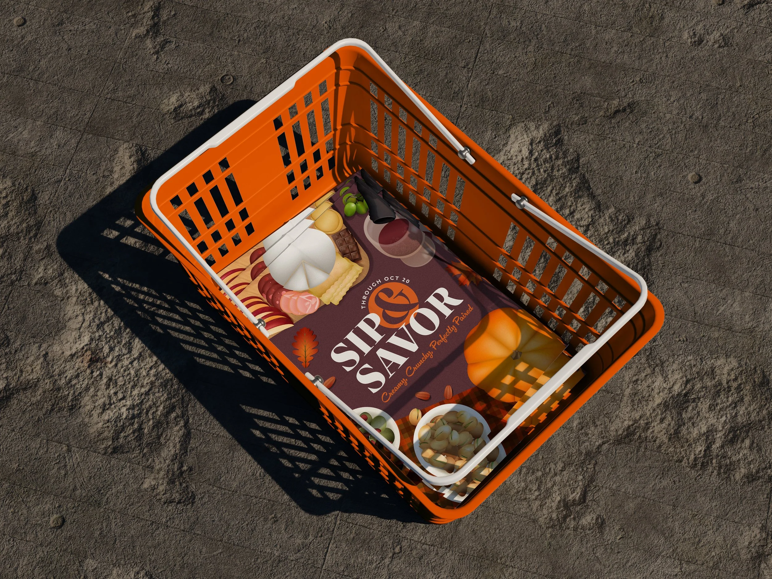
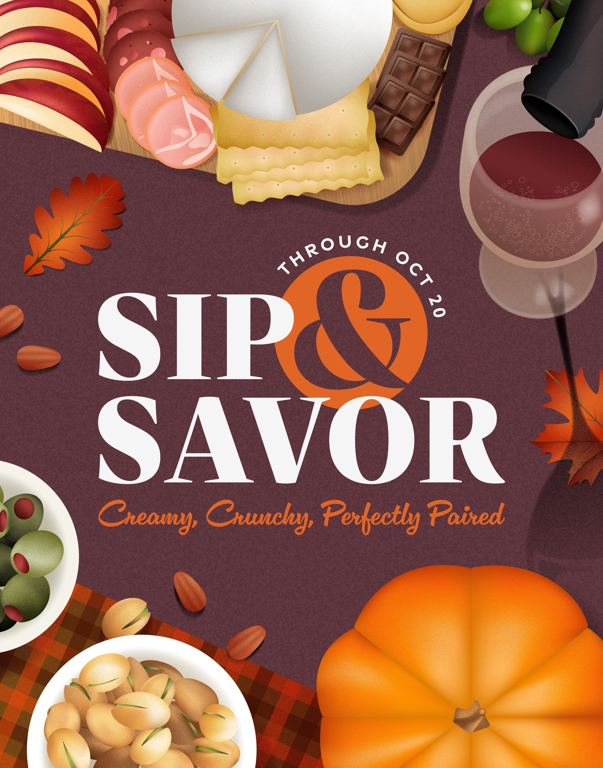
SIP & SAVOR
Throughout my time at Whole Foods Market—producing visual elements for advertisements and promotional campaigns—I’ve aspired to take on a more creative leadership role, conceptualizing and directing larger-scale projects. While my current role in the Studio Production team primarily keeps me behind the scenes, I’ve had the privilege of gaining insight into the creative team’s process for executing our monthly elevated events. One of my favorite things about food is its incredible ability to bring people together. Sip & Savor exemplifies this, offering a chance for loved ones to gather and indulge in a curated selection of products.
The event encourages customers to discover and enjoy life’s little luxuries, whether it’s a small indulgence or a moment of self-care. By featuring an array of products such as wine, cheese, fresh fruits, nuts, jams, spreads, dips, chocolates, candles, beauty and body care items, Sip & Savor creates a space where our customers can celebrate and elevate the everyday. This is exactly the type of project that inspires me—a chance to merge creativity with connection, enhancing how people experience both food and community.
This was a conceptual project and is not associated with Whole Foods Market.
DISCOVERY
During the discovery phase of this project, one of the earliest and most exciting challenges was naming the concept. I’ve always been drawn to the charm and memorability of alliteration, so I knew from the start that I wanted the name to reflect that. Sip & Savor encapsulated the essence of the experience I was striving to create. It wasn’t just about sampling delicious foods and beverages; it was about transforming simple gatherings into memorable experiences. However, settling on a tagline proved to be another creative challenge. I wanted something that would complement the name while elevating the overall concept. Initially, I had settled on the tagline Elevate Every Gathering.
I initially set out to capture the essence of Sip & Savor as a celebration of flavor, connection, and elevated indulgence. However, the first iteration lacked a clear seasonal identity. The color palette, illustrations, and typography didn’t anchor the event to a specific time of year or highlight the featured products in a compelling way.
To refine the concept, I revisited the core of Sip & Savor. Charcuterie boards and wine pairings are especially popular in the fall and winter, when people are hosting gatherings and looking for festive snacks. I determined that fall would be the ideal backdrop for the event, shaping the overall visual and thematic direction
With this in mind, I researched fall-centric grocery items commonly associated with charcuterie: pinot noir, brie, aged gouda, salami, prosciutto, apples, grapes, olives, pistachios, almonds, and pumpkin-infused pairings. To reinforce the autumnal theme, I introduced a richer, more seasonal color palette and visual elements like fall leaves, warm wood textures, and gingham napkins, evoking a cozy, inviting feel.
It was very important to me that texture was incorporated into the illustration, because it adds warmth and subtle depth to the compositions. The perspective is top-down, resembling a bird’s-eye view of a table setting, giving viewers a direct sense of participation in the dining experience. For the type lockup, I took cues from wine and cheese packaging, opting for classic serif fonts and elegant cursives. This creates a refined, sophisticated look that immediately connects with the products being featured. For the tagline, I wanted to highlight textures and flavor cues, leading to a revision from "Elevate Every Gathering" to "Creamy, Crunchy, Perfectly Paired." This evolution of Sip & Savor not only strengthens its seasonal presence but also heightens its appetite appeal.

